21 August 2009

Google Street View documenting humanity

I just read the most fascinating and beautiful post on Art Fag City about how Google Street View is an objective, impartial snapshot of humanity today. I had no idea such gems could be found there! It reminded me of this post about digital serendipity; you never know what you'll find as you're poking around the world from your desk.


Jon Rafman – the artist & guest blogger of the post – brings up about a million good points, but some of my favorites were about how Street View records the world: as it exists, at that very moment, in whatever state it is.
The world captured by Google appears to be more truthful and more transparent because of the weight accorded to external reality, the perception of a neutral, unbiased recording, and even the vastness of the project.
It definitely different from photographers who spend hours taking 500 shots, only to pick one that is perfect, no?


The last part of that quote – about the vastness of the project – is brought up again later: If Google chooses, their systematic storing of panoramic views serves photography’s historic role of cultural preservation. This could be a different version or perspective on things like the LIFE archives, maybe?

Rafman also brings up how technological phenomena like Street View are ongoing symbols of our world & how we interact with it evolves all the time. This very way of recording our world, this tension between an automated camera and a human who seeks meaning, reflects our modern experience. Beautiful, a little wistfully sad, and squeakily delightful all in one.
04 August 2009

Delightful error pages

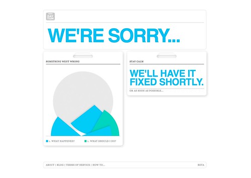
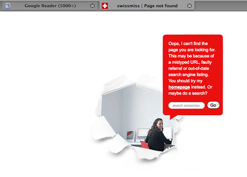
I know clever error pages aren't anything new, but I have seen 3 recently that I liked enough to take screen shots of.

This one was four or so months ago on Daytum:

Best error page ever.

Here's the swissmiss one I got a few nights ago:

Swissmiss error page

And this morning: Firefox.

Seriously, someone should do a study on this.

[click all for bigger if you can't read the text]

One would think error pages would = annoyed, I-just-want-to-use-the-site /find-what-I'm-looking-for thoughts, and they usually do... but these were disarmingly on-personality with each of the respective sites. Taking the time to put some effort into the little details and assuaging (hopefully infrequent) frustrations when things go wrong can go a long way, I guess*. I kind of want someone to do a psychological study on the effects of a disappointment framed in a charming way. Each of these times I smiled and forgot what I was even looking for or trying to do, and I was left with a positive feeling toward the site. An error page delighting someone? Pretty neat.

What are some of your favorites? Please share a screen shot or two if you can.

* One factor that matters though is obviously frequency: I have only seen each of these error pages only once. They can be as cute or clever as they want, but if they happen all the time (I'm looking at you, Fail Whale), they can somehow end up more maddening than a default error page. Over time, I began associating that whale with the Microsoft Office paper clip.

EDIT | The wonderful Amber just showed me this one she got at Sephora.com once:


Thanks Amber!
Related Posts Plugin for WordPress, Blogger...